Screen printing is a fascinating thing. It’s a means of creative expression, but it’s a business. It’s an art form, but it’s a science. It relies on one’s brain, but also on one’s physical ability. Unlike most art forms, screen printing is multi-dimensional. What do we mean by that? Well, in painting, brush is pressed directly onto canvas; in sculpting, hand is placed directly onto clay or stone; in tattooing, needle is pressed directly to skin. But in screen printing, while one’s design eventually makes its way onto a shirt, towel, or patch, it only gets there after a long and relatively complex process.
While painters and tattooists have the freedom to take their ideas and place them directly onto the canvas of their choice, custom clothing designers have to possess the knowledge, ability, and foresight to design effectively and make their ideas work.
And that’s where we come in. Whether you’re a seasoned graphic designer with a wealth of knowledge and experience, or you’re preparing for your first trip to the t-shirt printing rodeo, we’ve compiled a list of some helpful tips to consider while drafting your masterpiece:
Keep Your Colors Simple!

To artists like Van Gogh and Picasso, colors meant the world. Traditional painters and most other artists take free reign when it comes to the use of colors, and it’s not untypical to see paintings that use literally dozens of them on a single canvas.
Things are a little different with screen printing. It is in every way as valid an art form as painting or its other contemporaries, but in screen printing, every color counts and needs to serve a distinct purpose.
Conceptually, too many colors can often create clutter in designs where space is very limited and meaning needs to be direct. Is the world your art gallery? Sure! But unlike an art gallery, people on the street can’t take 15 minutes to stare at a single t-shirt design (because that’s super weird). We see what people are wearing for very brief moments; as we cross paths at the subway station, or in the coffee shop, at the grocery store, etc. Your message – whatever it may be – needs to be clear, impactful, and memorable.
In screen printing, delivery is an art form in itself.
Logistically, colors cost – plain and simple. The more colors you use, the more screens need to be set up, and the more money you pay in prep work. Here at Rush Order Tees, we can print apparel with up to eight different colors, but we mostly work with between one and three. You’d be surprised what one can do with a couple well-strategized colors!
Forget About Smooth Transitions!

Were we life coaches and you our client, we’d tell you that consistent and smooth transitions are always going to be the best course to take. But we’re not your life coach (you’re probably better off), and you’re seeking lessons about designing for screen printing applications, not life.
In graphic design, gradients are the smooth transitioning of one color into another through a range of other complementary colors. They look great and can really add some wild detail to a painting or piece of art work.
But in screen printing, gradients are a wrench in the gears. Mixing colors on a screen printer is exceptionally difficult, because you have to use one screen, and for every single shirt, you have to re-mix the colors. The process is inconsistent and incredibly time consuming.
In screen printing, the alternative to crazy color gradients is halftones. They create the visual illusion of smooth color transitions, and they look great when properly applied. They’re efficient, consistent, and they deliver the same effect as a gradient without a fragment of the hassle.
Your Canvas Size Counts!

When designing for screen printing, your canvas is just as important to your design as your colors. When designing, an astute and experienced screen printer takes everything into consideration – the size and shape of the garment, the type of fabric the garment is made of, the variation in surface area of different sizes (small, medium, large, extra-large, etc.). All of those details should play an active role in the design process.
Say, for instance, you really love cats. You have 10, they’re your life, and you want to immortalize them – all 10 of them – on a t-shirt that you’re going to give your family on your next vacation together. You want each of the 10 cat faces to be presented as big and bold as possible, so you create this epic design that you want to utilize the entire front of a regular men’s t-shirt. And that’s awesome (no really, that’s pretty awesome).
But you don’t take into consideration that your little brother is only 3 and wears a youth small, or that your father has kind of let himself go over the years (he says he’ll sign up for the gym next week, so it’s cool, though), or that your mother is a woman (yes, it matters – there are gender-specific types of t-shirts!).
You create this beautiful design for this one size t-shirt, but then realize that same design wraps around the entire front and back of your brother’s youth small, and fit’s your father’s 2xl like a Starburst wrapper on a watermelon.
If you’re on a budget, make sure your design is big or small enough to accommodate different sizes of shirts.
Your Canvas Color Does, Too!

Similarly, it’s important to take color into consideration, as well – for several reasons.
Firstly (and most obviously) some colors work well together, and others don’t. There’s an entire science behind this, but the basic idea designers need to consider is that while you probably wouldn’t be caught dead in a yellow t-shirt and lime green pants (Or maybe you would? We won’t judge you, man!), those two colors provide a very high level of contrast and a ton of visibility. From a designer’s perspective, they work, and work well. From a person who doesn’t want to look color blind’s perspective, they’re a terrible, terrible idea.
On the other hand, trying to use a black design or black font on a black t-shirt is a major no-no. While black matches black (… Duh?), it also doesn’t contrast with itself, which means that it provides ZERO visibility on your garment. The better the contrast, the more visibility your design has. We know, we know – that seems like a no-brainer; a no-brainer until you’re in charge of printing a large order of t-shirts on several different styles and colors of shirts. It’s hard to keep track of details like that, but it’s a critical aspect of design, nonetheless. Remember: delivery is a huge component of this art form.
Bold is Beautiful!
In screen printing, bold is beautiful. Making your message as easy to convey as possible is the name of the game, and your customers, fans, and audience will appreciate it. While attention to detail is obviously important, carefully selecting where on places and how one demonstrates that attention detail is what separates good designers from great ones.
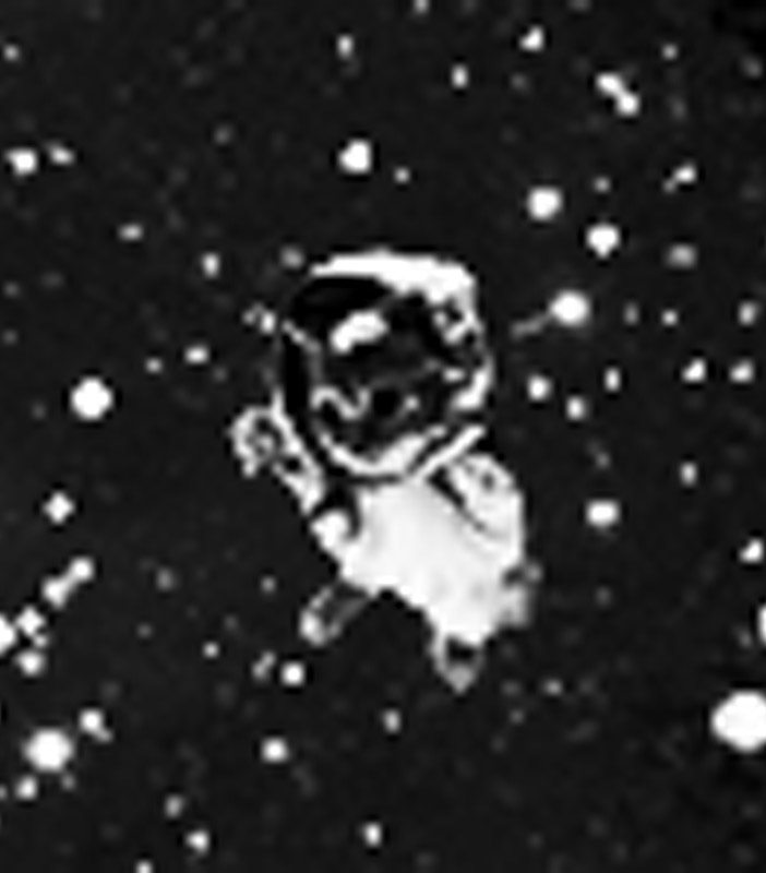
Take the design below, for example. It’s imaginative and creative, and is a really cool, captivating piece of art. The detailed and distinct grouping of the stars and the galaxies, the dome of the observatory, the beautiful pine trees in the backdrop; it’s beautiful. Now look closer. What if we told you the focal point of this entire design was the cat in the space helmet floating around in the atmosphere, near the top-right portion of the design?

No, really, it’s there. Look:

See what we mean? The design is really great. It’d be a tough one to screen print, but it could definitely be done. The problem is that the most important detail of it is so subtle that it becomes lost in the myriad of the design’s other quality components.
Creating a design that makes space kitty a more prominent aspect of it would be a great alternative. It could still incorporate a wild array or stars and galaxies and all that great, fun, and creative stuff, but placing more emphasis on Space Kitty helps real drive the message home: Space rules, but a cat in space rules harder. That is the message, right?
Of course, there are plenty of other things new and even experienced artists overlook in the design process. We polled our talented team of graphic designers, who review thousands of customer-submitted works of art every day, and these were the five most common errors they encounter on a daily basis.
You know what they say: “Practice makes perfect!” So get practicing, and if you have any questions or concerns, or want us to help turn your dream tee into a reali-tee, head on over to RushOrderTees.com! We’d be happy to help.
Written by Max
Maxwell Barna is a Public Relations Manager and Resident Content Monkey at Rush Order Tees, one of the premier screen printing companies in the U.S. He has a deep appreciation for quality screen printing, well-designed t-shirts, and good Scotch. You can check out more of his work at the Rush Order Tees blog (www.rushordertees.com/blog).

